
Brand
Brand
How Urganize looks, sounds, and what it stands for — plus the logos and assets to represent us. Using anything here? Keep it verbatim and unaltered, and ask us if you’re unsure.
01 — Foundations
What Urganize stands for
Mission
The music industry runs on chaos — tribal knowledge, scattered group chats, spreadsheets, and one overworked person holding every release together. Urganize is the system of record for the release: where the plan lives, where the work happens, where the team sees status.
Positioning
Operational infrastructure for music industry teams. The system of record for the release.
Who it’s for
Urganize is built for artist managers and small labels running more than one artist. If a roster means multiple release calendars, multiple masters to track, and a scatter of chats holding it together, this is the system for that. Labels running a bigger roster get the premium Label tier, with the founders on call.
What we believe
- The release is the spine. Every feature serves a release.
- Opinionated by default — if it doesn’t reduce operational chaos, it’s out.
- So we don’t do: revenue tracking, legal contracts, analytics dashboards, or distribution. We stay the system of record.
Boilerplate — copy / paste
Urganize is the system of record for music releases: a hand-crafted rollout plan, tasks with owners and due dates, and every release file in one workspace. Built for artist managers and small labels running more than one artist, with a Label tier for teams managing a bigger roster hands-on.
The Urganization Ltd. Started December 2025. Meet the team.
02 — Voice & tone
How Urganize speaks
Four pillars, drawn from how the product already talks. Draft — refine as the voice settles.
Plain-spoken, no jargon
We call it a “system of record,” not a “synergistic platform.” If a sentence needs a decoder, rewrite it.
- We say
- Every file, filed.
- Not
- Holistic asset-lifecycle management.
Concrete, never overclaiming
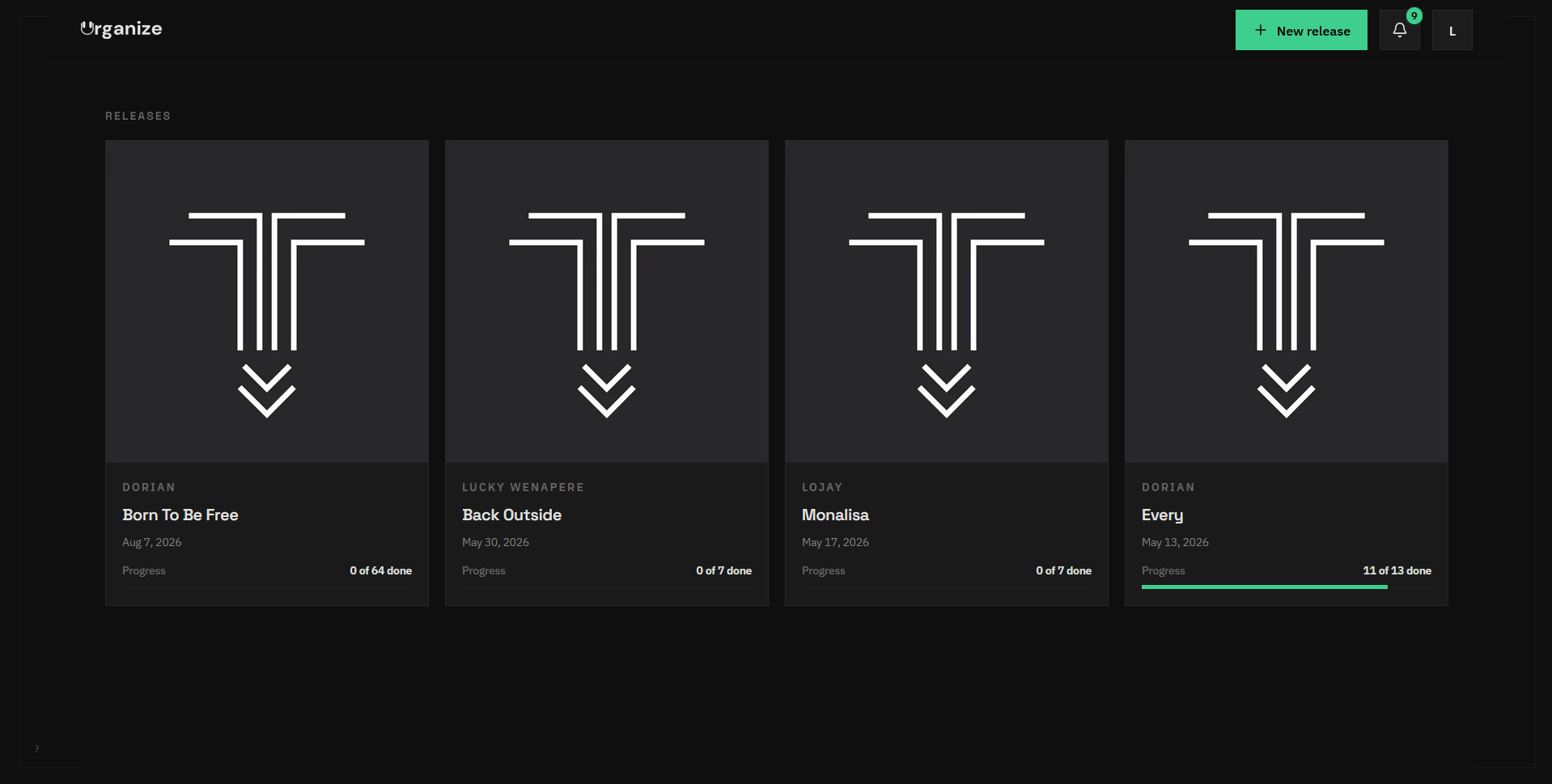
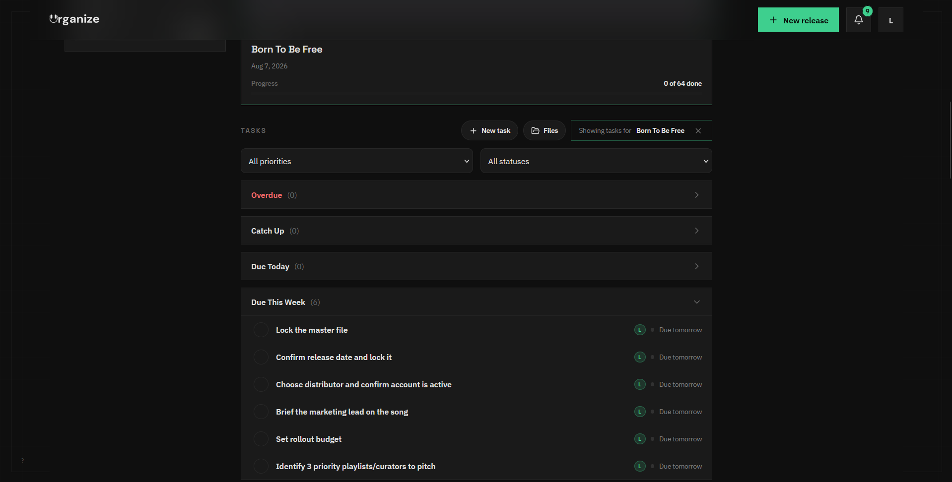
We don’t advertise what isn’t built. Unshipped work is marked “coming soon,” and screenshots show the real app.
- We say
- 64 tasks, generated from a template.
- Not
- AI runs your whole release for you.
Name the problem
We say the quiet part out loud: releases run on group chats and “Final v3 ACTUAL final” in Drive. The enemy is chaos — we name it.
- We say
- Stop running releases out of WhatsApp threads.
- Not
- Streamline your creative workflow.
Operator to operator
We write like a manager talking to a manager — benefit-first, active, specific. We’ve run releases; the copy shows it.
- We say
- No more “who’s doing the art again?”
- Not
- Empower your creative journey.
Tone tells: active voice, specific over abstract, the em dash earns its keep, emphasis set in the brand green.
Words from others run verbatim. Testimonials and bios are published with sign-off and never edited after approval.
03 — Visual identity
How Urganize looks
Logo
The wordmark is the primary mark; the “U” is the standalone icon. On light surfaces use the dark lockup; on dark, the light one. Don’t recolor it, stretch it, add effects, or box it in.
Color
Warm paper — the light background
Primary text
Marketing emphasis + links (light)
Same accent on dark surfaces
The app UI accent (app.urganize.app)
Typography
Cormorant Garamond
Display & headings — the editorial serif
Instrument Sans
Body & UI text
IBM Plex Mono
Eyebrows & labels (the uppercase mono kicker)
The product app (app.urganize.app) uses its own system — IBM Plex Sans, Space Grotesk, and JetBrains Mono.
Motifs
Monospace uppercase eyebrows. Hairline rules and grids. Golden-ratio spacing. A warm-paper canvas with serif headlines, and emphasis set in green.
04 — Assets
Download
Logos



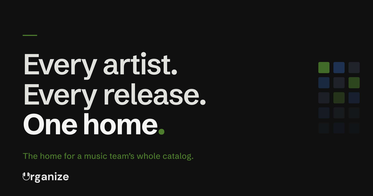
Images & screenshots
Media contact
Press inquiries: contact@urganize.app